
Visualizing Retrenchment & Vacancies In Singapore using Numpy, Pandas, Matplotlib
Learning Objective
Using the modules to clean, transform and visualise Singapore retrenchment and job vacancies data from 1998 - 2020.
Dataset
Data from: data.gov.sg
Importing data as Pandas dataframe and cleaning data
import numpy as np
import pandas as pd
import matplotlib.pyplot as plt
# read retrenchment file into dataframe
xls = pd.ExcelFile('retrenchment-by-industry-level-2.xlsx')
df_retrench = xls.parse('retrenchment-by-industry-level')
# Split into year and quarter:
df_retrench["year"] = df_retrench["quarter"].str.split('-').str[0]
df_retrench["quarter"] = df_retrench["quarter"].str.split('-').str[1]
# move year to the first column
df_retrench.insert(0, "year", df_retrench.pop("year"))
# Convert values to flaot & coerce invalid values to NaN, then replace NaN with 0 and convert all to integer
df_retrench['retrench'] = pd.to_numeric(df_retrench['retrench'], errors='coerce').fillna(0).astype('int')
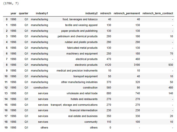
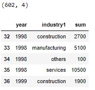
print(df_retrench.shape)
df_retrench.head(20)
Q: Did we face the most severe retrenchments in 2020?
df_retrench_year = df_retrench.groupby(["year"]).agg([np.sum, np.mean])["retrench"].reset_index()

# Plot a line chart to visualise the retrenchment from 1998 till 2020
fig, ax = plt.subplots(figsize=(12,6))
plt.plot (df_retrench_year["year"], df_retrench_year["sum"],
          color = "orange", marker = "o",
          markersize = 10, label="All Industry")

plt.xlabel('Year')
plt.ylabel('Retrenchment')
plt.legend(loc='best')
plt.title("Retrenchment by Year (All industry)",fontweight ='bold', fontsize = 15)
plt.grid(b=True,alpha = 0.3)
plt.show()
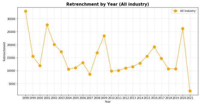
From the chart above, we identified that Singapore experienced highest retrenchments in year 1998, 2001 and 2020.
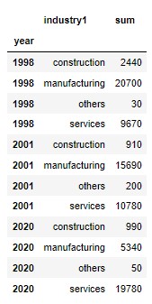
Q: Which were the most badly impacted industries in these 3 years (1998, 2001, 2020)?
df_retrench_year_industry = df_retrench.groupby(["year",'industry1']).agg([np.sum])["retrench"].reset_index()

select_year = df_retrench_year_industry["year"].isin(["1998", "2001", "2020"])
df_retrench_3year_industry = df_retrench_year_industry[select_year]

df_retrench_3year_industry.set_index("year", inplace = True)
df_retrench_3year_industry
# Plot a bar graph to visualise the retrenchment by industry in these 3 years
# set width of bar
barWidth = 0.25
fig, ax = plt.subplots(figsize =(12, 6))

# set height of bar
construction = df_retrench_3year_industry[df_retrench_3year_industry["industry1"]=="construction"]["sum"]
manufacturing = df_retrench_3year_industry[df_retrench_3year_industry["industry1"]=="manufacturing"]["sum"]
services = df_retrench_3year_industry[df_retrench_3year_industry["industry1"]=="services"]["sum"]

# Set position of bar on X axis
bar1 = np.arange(len(construction))
bar2 = [x + barWidth for x in bar1]
bar3 = [x + barWidth for x in bar2]

# Make the plot
plt.bar(bar1, construction, color ='#b30000', width = barWidth,
        edgecolor ='grey', label ='Construction')
plt.bar(bar2, manufacturing, color ='#003d99', width = barWidth,
        edgecolor ='grey', label ='Manufacturing')
plt.bar(bar3, services, color ='#00802b', width = barWidth,
        edgecolor ='grey', label ='Services')

# Adding Xticks
plt.xlabel('Year')
plt.ylabel('Retrenchment')
plt.title("Years with Highest Retrenchment (Industry Breakdown)",fontweight ='bold', fontsize = 15)
plt.xticks([r + barWidth for r in range(len(construction))],['1998','2001','2020'])

plt.legend(loc='best')
plt.show()
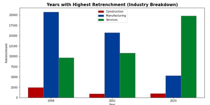
Unlike the 2 earlier years, where manufacturing was the industry facing most retrenchments, in 2020, services was the most badly impacted industry.
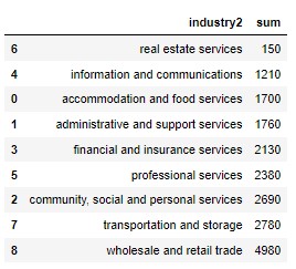
Q: Which line of service experienced the highest retrenchment in 2020?
df_retrench_services = df_retrench["industry1"]=="services"
df_retrench_2020 = df_retrench["year"]=="2020"
df_retrench_services_2020 = df_retrench[df_retrench_services & df_retrench_2020]

df_retrench_services_2020 = df_retrench_services_2020.groupby("industry2").agg([np.sum])["retrench"].reset_index()
df_retrench_services_2020 = df_retrench_services_2020.sort_values(by=['sum'],ascending=True)
df_retrench_services_2020
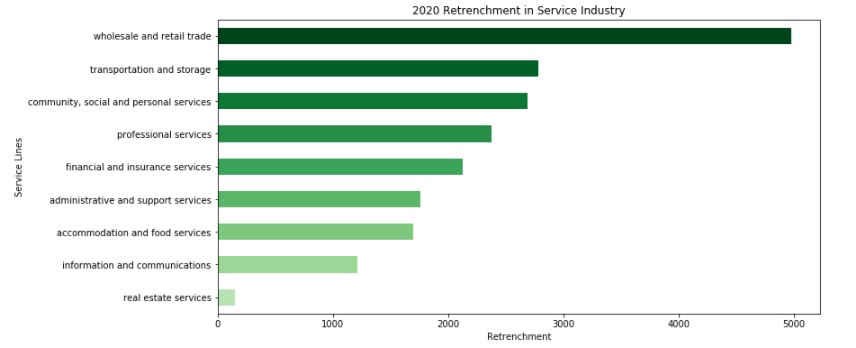
# plot a horizontal bar graph to visualize retrenchment in service industry
from matplotlib import cm
n = len(df_retrench_services_2020)
colors = cm.Greens(np.linspace(0.3, 1, n))
ax = df_retrench_services_2020.plot.barh(x='industry2', y='sum',
                                figsize=(12,6),
                                legend = False,
                                title = "2020 Retrenchment in Service Industry",
                                color = colors)

ax.set_ylabel('Service Lines')
ax.set_xlabel('Retrenchment')
plt.show()
Q: Were there enough vacancies in the service industry in 2020?
# read vacancy file into dataframe
xls = pd.ExcelFile('job-vacancy-by-industry-level-2.xlsx')
df_vacant = xls.parse('job-vacancy-by-industry-level-2')
print(df_vacant.shape)

df_vacant['job_vacancy'] = pd.to_numeric(df_vacant['job_vacancy'], errors='coerce').fillna(0).astype('int')
df_vacant_industry = df_vacant.groupby(["year","industry1"]).agg([np.sum])["job_vacancy"].reset_index()
df_vacant_1998 = df_vacant_industry[df_vacant_industry["year"]>1997]
df_vacant_1998.head()
# Plot a line chart to visualise the relationship between retrenchment and vacancy in service industry
df_retrench_year_industry["year"] = df_retrench_year_industry["year"].astype('int')
df_retrench_ex_2021 = df_retrench_year_industry[df_retrench_year_industry["year"]<2021]
df_retrench_service_ex_2021 = df_retrench_ex_2021[df_retrench_ex_2021["industry1"]=="services"]
df_vacant_service = df_vacant_1998[df_vacant_1998["industry1"]=="services"]

fig, ax = plt.subplots(figsize=(12,6))
plt.plot (df_retrench_service_ex_2021["year"], df_retrench_service_ex_2021["sum"],
          color = "Red", marker = "o",
          markersize = 10, label="Retrenchment")

plt.plot (df_vacant_service["year"], df_vacant_service["sum"],
          color = "Orange", marker = "o",
          markersize = 10, label="Vacancy")

plt.xlabel('Year')
plt.ylabel('Total')
plt.legend(loc='best')
plt.title("Retrenchment & Vacancy by Year (Services industry)",fontweight ='bold', fontsize = 15)
plt.grid(b=True,alpha = 0.3)
plt.show()
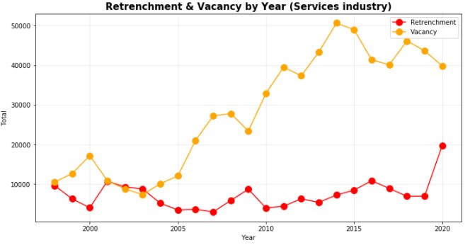
We see lower number of vacancies and increased retrenchments in 2020, but it seems like there were still a big gap of vacancies unfilled.
Q: Where in the service industry did the vacancies lie?
df_vacant_services = df_vacant["industry1"]=="services"
df_vacant_2020 = df_vacant["year"]==2020
df_vacant_services_2020 = df_vacant[df_vacant_services & df_vacant_2020]
df_vacant_services_2020.dtypes
df_2020_ret_vac = pd.merge(left = df_retrench_services_2020,
right = df_vacant_services_2020,
how ='inner',
left_on ='industry2',
right_on ='industry2')
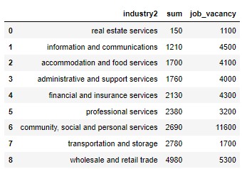
df_2020_ret_vac = df_2020_ret_vac[["industry2","sum","job_vacancy"]]
df_2020_ret_vac
# Visualize the retrenchements and vacancies to find out where the vacancies were in service industry.
df_2020_ret_vac.plot.barh(x='industry2',stacked = False,
                       figsize = (12,6),
                       fontsize = 12, color = ["#ff6600","#ffc299"],
                       legend = True,
                       title = "2020 Retrenchment and Vacancy in Service Industry")

plt.legend(["Retrenchement", "Vacancy"])
plt.xlabel("Total")
plt.ylabel("Service Lines")
plt.show()
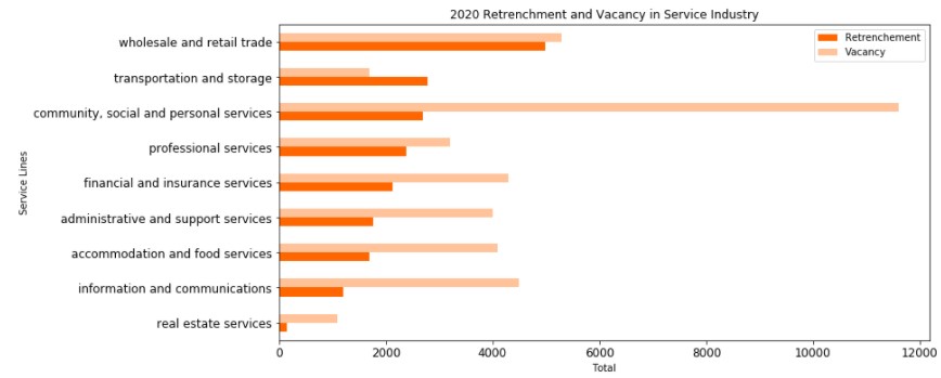
8 out of 9 lines in service had higher number of vacancies than number of retrenchments.
Transportation and Storage was the 1 line of service that had higher number of retrenchments than vacancies. This is understandable as Covid lockdown in Singapore had restricted movements of individuals, and hence many workers from this line of service were made redundant.
It appears that Community, Social and Personal Services had the highest vacancy gap in 2020.
According to data.gov.sg, below groups of occupations belong to the field of Community, Social and Personal Services:
- Public administration and education
- Health and social services
- Arts, entertainment and recreation
- Other community, social and personal services
Was there a shortage of manpower in the line?